After World War II the center of the art world changed from Paris to New York. The European tradition was shunned as artists searched for a new voice. But after a generation of rebellion, artists of the 1970s started to look back again to the classical tradition. What followed could be a case of “lost in translation.”
Has someone ever asked you why you like an image? Beneath the surface of a great picture, there is a geometric design in hiding. In this ‘Great Compositions’ series, we will search for the dynamic symmetry that photographers and artists have used for centuries to create successful works of art.
There are a few terms we need to understand before starting the analysis. Then everyone will be speaking the same language.
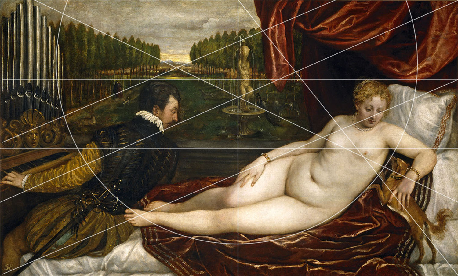
• 1:1.5 Ratio: The 35 mm negative measures 36 mm x 24 mm. Mathematically, it can be reduced to a 3:2 ratio. Reduced even further it will be referred to as the 1:1.5 ratio or the 1.5 rectangle.
• Eyes: The frame of an image is created by two vertical lines and two horizontal lines. The intersections of these lines is called an eye. The four corners of a negative can be called the ‘eyes.’ This is extremely important because the diagonals connecting these lines will form the breakdown of an image.
• Armature: When we use specific rectangles, there is a system of connecting and intersecting lines that create a grid, or armature, which will form the composition. They are created by finding specific diagonal lines and their reciprocals.
• Gamut: As we will see, there are 360 degrees in the image circle of a lens. This creates more lines in any armature than we would like to use. The limited number of directions we use in a composition is called the ‘gamut.’ Good artists rarely use more than five or six in any one image. As Myron Barnstone taught me, if you use all the lines of the grid, your picture will look like the bottom of a bird cage.
• Intervals: These are lines that are repeated throughout that create a rhythm in a picture.
• The Horizontal, Vertical, & Diagonal Lines: Artists have a very limited alphabet at their disposal. They have a point, a vertical, horizontal and diagonal line, and a curve, which is also known as an arabesque. In order to successfully design compositions, all good artists and photographers organize schemes with straight lines.
• Major Lines: In an image, we are creating a hierarchy. If there is no hierarchy, it is very difficult for the viewer to understand what is important in an image. There is usually a single vertical, horizontal and diagonal line that dominates a composition.
• Reciprocal: This is a line that intersects a diagonal at a 90 degree angle. Introducing the reciprocal will strengthen an image by reinforcing the diagonal. But be careful, it should support not compete with the diagonal.
• 1.5 Armature: There are two ways to break down a 1.5 rectangle. The most basic is the 1.5 Armature. It is created by drawing two diagonals from each corner of a negative. Then draw their reciprocals from opposing corners, which intersect the diagonals at 90°. Through the ‘Eyes of the Diagonal’ and their reciprocals, draw vertical and horizontal lines through their intersections. The 1.5 Armature was a very popular method used by Cartier-Bresson early in his career.
At the end of the 1940s American art took a radical shift. The New England seascapes of Edward Hopper (who was trained in Paris at the turn of the century) and the Hudson River School were no longer in vogue. The new breed of abstract expressionists, spearheaded by Jackson Pollock, was the new direction of art. Gone were the history paintings of magnificent battles or the royal portraiture of deceased monarchs. Drips and lines of paint were the popular voice for artists to ‘express’ themselves. For what it was, abstract expressionism certainly left its mark on culture and the art world. While it was not the first time artists were confronted with the accusation of, “my kid could have done that,” they were certainly making that phrase more popular.

Behind the scenes was a mixture of classically trained artists and some who could never even draw, like Jackson Pollock. Unlike Willem de Kooning who was a trained artist, Pollock’s drip paintings were really born out of an inability to draw. As I have studied Pollock over the years, it seems that his ‘drip’ paintings were a way for him to create images without having to actually draw, an act for which he possessed no talent. I tip my hat to him because he successfully worked around a handicap of sorts. But when the abstract expressionists rejected the classical traditions of Europe they seemed to have thrown the baby out with the bathwater. This is not to say the tradition was entirely lost. Artists like Ellswoth Kelly retained and carried on classical traditions in a contemporary voice. My mentor Myron Barnstone elaborates on this idea in a short video from his DVD series, which is recommended for anyone interested in creating better photographs.
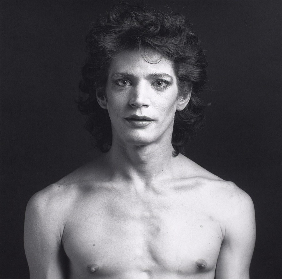
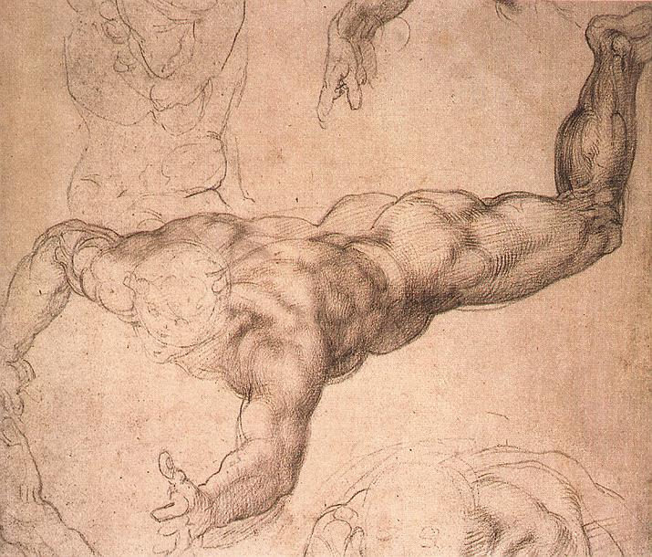
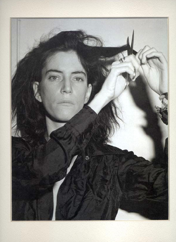
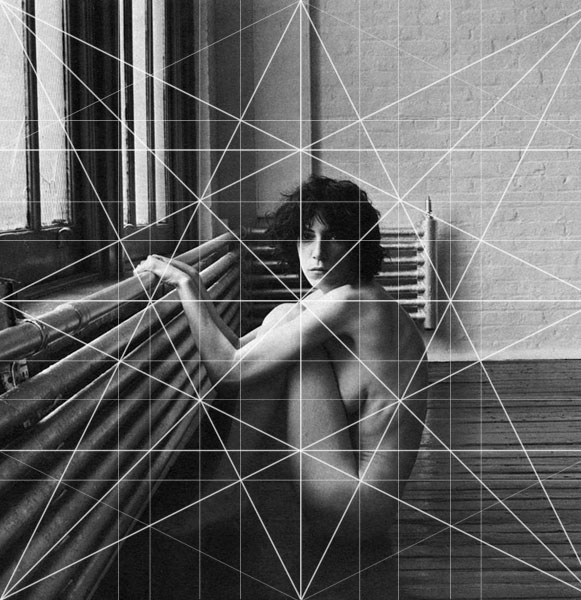
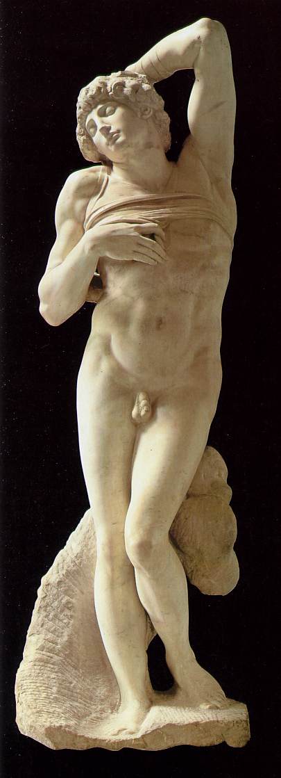
Twenty years later, a young Robert Mapplethorpe enrolled in Pratt University in Brooklyn, New York. He was looking for his artistic voice. With a camera he followed the classical traditions of Michelangelo, Caravaggio, Ingres, and Schiele. The themes in his work encompassed the nude form, sexuality, the budding relationship with an unknown poet and musician named Patti Smith, but when I started analyzing Mapplethorpe’s work I found that something was off. The photographs did not have the potency of a Caravaggio or an Ingres. Even though his nudes are more explicit, they lack a compositional strength which creates a flatness to the images. Unlike his classical influences, Mapplethorpe does not appear to have a strong background in geometry, something that Michelangelo studied for over ten years as he worked his way through Andrea Verrocchio’s studio and the Medici circle of artists.
After analyzing about fifty of his images it became clear that there are three main problems that keep Mapplethorpe from sitting at the table with the great compositional masters.
Geometry was and probably should be a major part of any artistic education. When you go to a book store and realize that 9 out of 10 books published on art are for painters, you begin to realize how important the rectangle, square, and triangle are to the history of art.
Mapplethorpe worked in two main formats – the square negative, 1:1 of a Hasselblad medium format camera – and the Root Phi (1:1.272) of the Polaroid camera. Within these two formats are a lengthy tradition of creating movement, the illusion of space, and flowing action in a composition. As we will see in the analysis, Mapplethorpe was certainly influenced by classical artists, but does not appear to understand the systems of design they used called Dynamic Symmetry.
After analyzing about fifty of his images it became clear that there are three main problems that keep Mapplethorpe from sitting at the table with the great compositional masters:


1. Each image has an clear vertical, horizontal, and diagonal element, but they very rarely work together to add strength to the image. They function like independent gears, each spinning at different speed, which give the appearance of function, but do very little in terms of creating movement.

2. If a major direction or thrust is to occur in a photograph, it needs to be supported by smaller parallel actions. Otherwise, it is a stand alone voice. Many of his images have competing angles that weaken an overall composition. In the case of a nude, the support could come from other, less important body parts. Or if there is a subject in a room, the architecture or the elements of the space can reflect the thrust of an image to make it stronger. When this does not occur the images become like one line jokes.
3. The lighting in a number of the images tends to flatten the subject, rather than enhance the illusion of the third dimension. When photographers want to create the illusion of depth, there are some lighting techniques that will make a flat shape feel like a volume, like you could reach out an grab it.
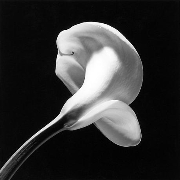
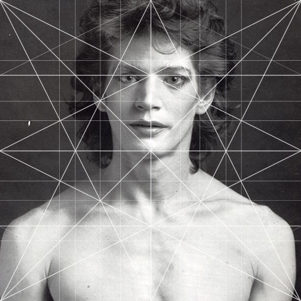
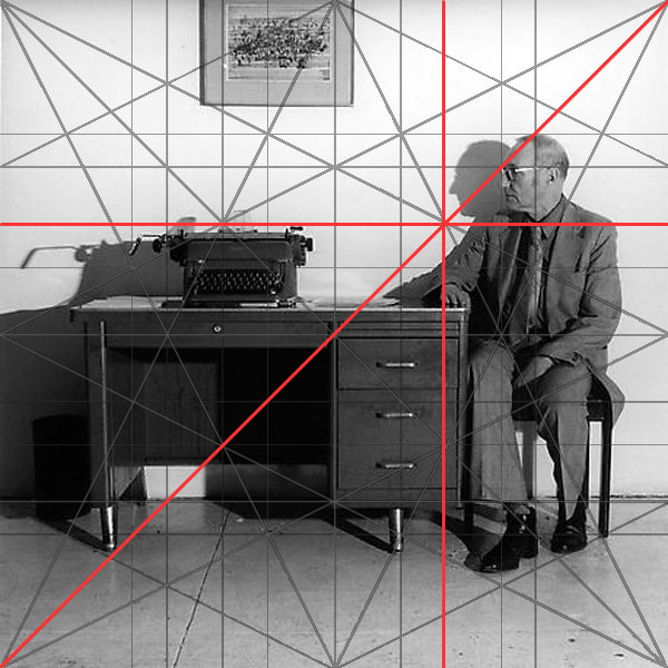
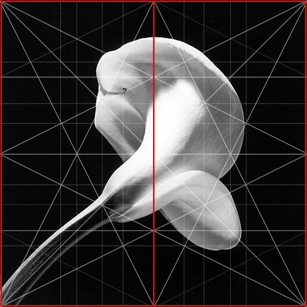
Let’s examine this “Calla Lilly” photograph done towards the end of Mapplethorpe’s life, before his early death at age 43. From a compositional stand point this is one of his more successful images because:
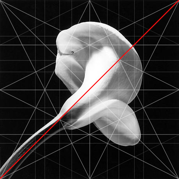
1. He establishes a Baroque Diagonal running from the lower left to the upper right hand corner of the image. There is almost a continuous line through the stem and the flower that occupy 80% of the entire image.
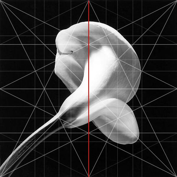
2. The Dominant Vertical is located in the center of the frame, which is a successful technique that can be employed in a square format.
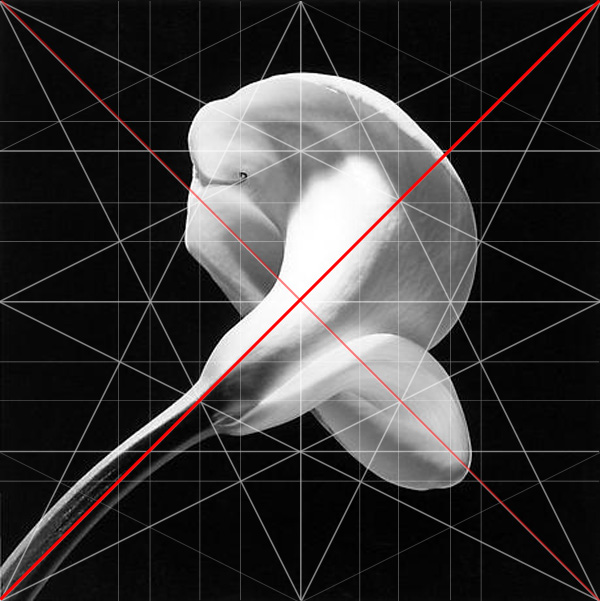
3. The Sinister Diagonal intersects the Baroque at 90° in the center of the image. This establishes the hierarchy of the picture. The flower grows up the right and curls back to the left. The right hand movement is stronger and more powerful. The left hand movement adds strength without overpowering the initial thrust.
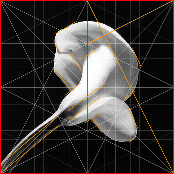
4. One thing to note, a square can be broken into two Root Four rectangles on their sides. The diagonal of the Root Fours and their reciprocals (the lines that intersect them at 90°) repeat the geometry of the flower. By repeating a shape it makes its role in an image stronger. This is not much different than they way we structure our language. When we want to make a point, it is best to state it clearly, then add supporting comments, and finally, repeat the original idea again. This photograph works exactly in this way.
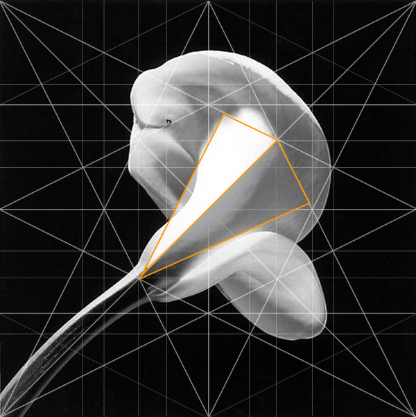
5. Lastly, he establishes the core of the shadow in the flower and allows for some reflected light. Ideally we would like to establish the core of the shadow in the third, but even though this one is in the half, it allows our eye to follow the line of the stem. Had he shifted the shadow further down and to the right, he would have strengthened the curve or arabesque on the flower. We will see how Caravaggio is a master at introducing movement through the arabesque. By establishing the shadow in the middle of the pyramid, he flattens the shape. We will see this to be a consistent mistake in his work. Maybe he wanted to flatten the shadow. There are plenty of artists like Cézanne, Morandi, Seurat, and Picasso who wanted to keep their canvases flat. But the give away that Mapplethorpe did not intend to create flatness is that he never created volumes well. Before master artists broke the rules, they would prove that they could do all the tricks of their teachers. Then they would make their departure.
What can we learn from analyzing images? When you start to breakdown a number of images, over the course of an artist’s life, you begin to see how their mind was working. Everyone plays with different techniques and reaches varied degrees of success which glow like a billboard once you know what to look for.
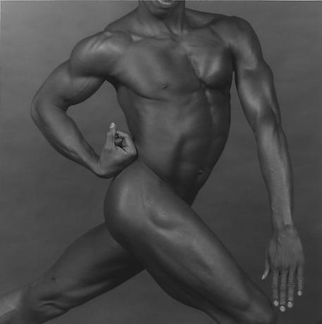
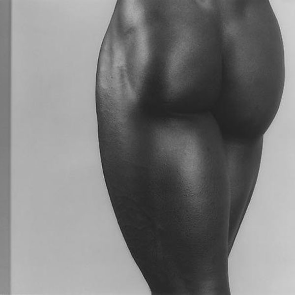
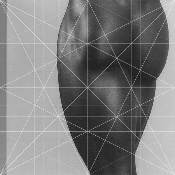
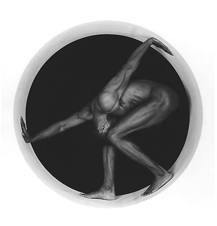
The primary trend in Mapplethorpe’s images was based on content. It is more important for the success of his work ‘what this image is of’ than ‘how it is composed.’ We can see in the following images that most of the pictures have the compositional strength expected of him when he graduated from Pratt as a student. They have a single main direction, occasionally reinforced by reciprocal directions. Where there were opportunities for the limbs of his subjects to strengthen the composition, the images just miss. In “Derrick Cross” (1983) we see two major violations of volume and composition.
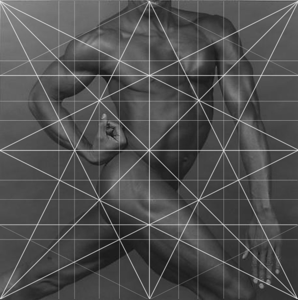

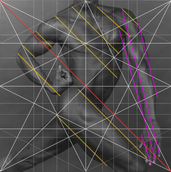
I think you can start to see the pattern of analysis, so I will go a little quicker. The baroque diagonal runs through the leg and through the upper arm. It would feel less stiff if he was more relaxed and the baroque passed through his upper shoulder (on the right). But the arm on the right is the real problem. Most of the body follows the Sinister Diagonal, except for the arm on the right. It violates all sense of movement by falling to the bottom corner at an irrelevant angle. The lines marked in purple clash terribly with the thrust of the image. If you use something that is close to a parallel but slightly off, it ruins the strength of a line. This is certainly something that could have been corrected in the studio, but these repeated mistakes run through much of his work, which leads me to believe he was looking at classical artists, but not really understanding their designs.
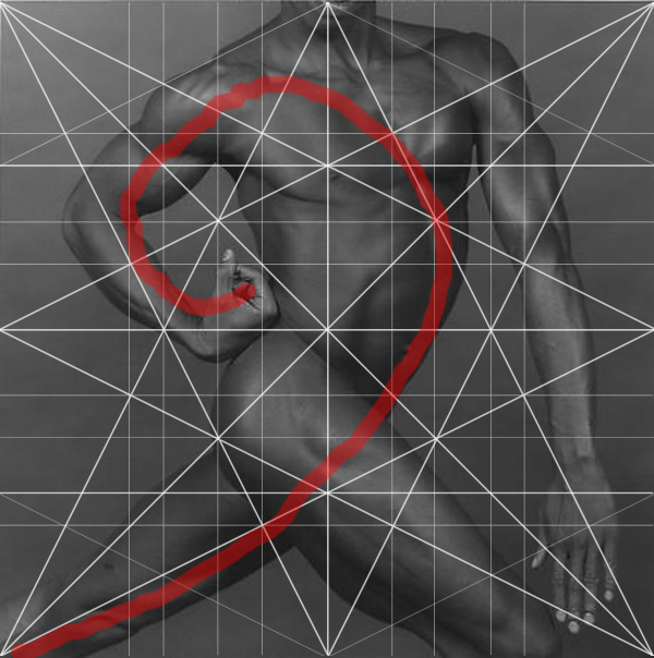
The hand on the left starts to create a spiral, but it has no bearing on the overall shape of the composition, which is why it does not work so well. It’s a good idea, but poorly placed to be effective. If it were to fall on a major division it might have had more power.
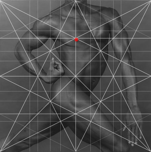
The placement of the nipple makes it the most important part of the picture. I doubt this was the intention. My guess is the musculature is more important, but by landing the nipple in the center of the picture, it steals the show.
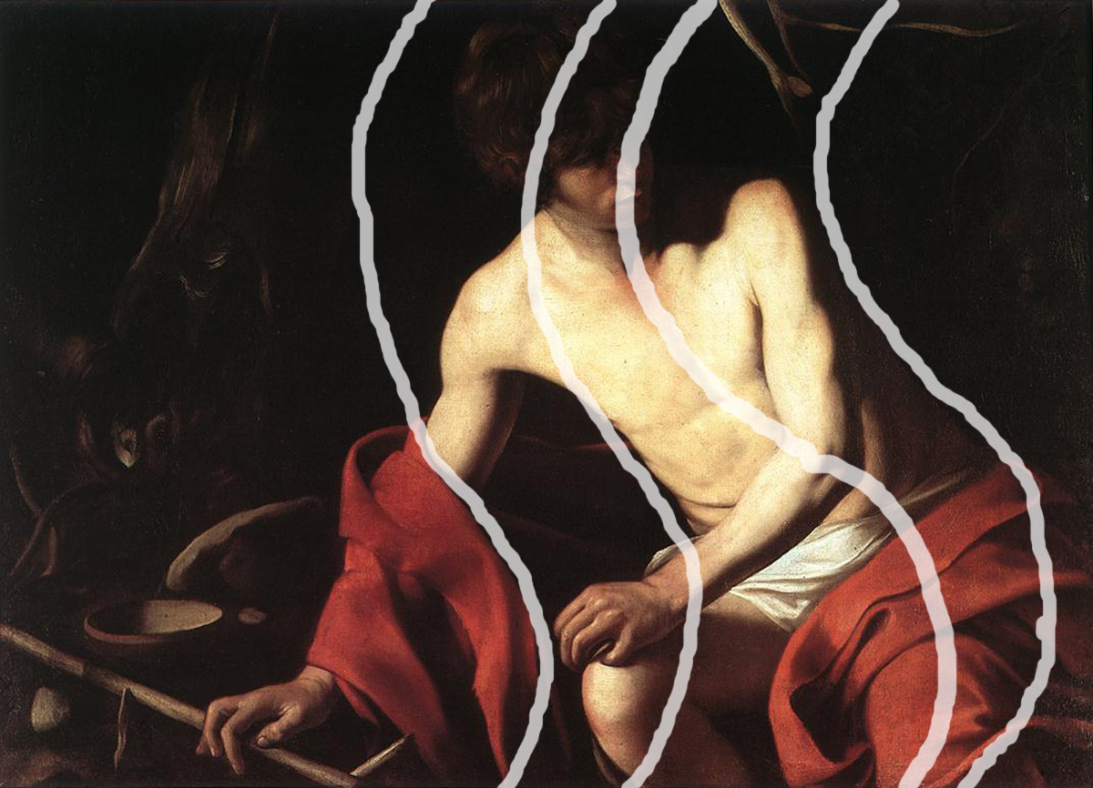
Where we see Caravaggio really excel is in the ability to create sensuous curving lines throughout the image. The human body comes alive when we see a soft S curve to the form. In Derrick’s image we are looking at a reversed “C” not an “S.” It reads as rigid and strong, but the most dynamic pieces are usually strong and flowing. We know that Mapplethorpe was heavily influenced by the sculptures of Michelangelo whose Slave series in particular has an erotic charge that is still popular with artists today. In each piece we see muscular forms that feel like they are actually moving. One of the reasons they work so well is due to the strength of their arabesque. Unfortunately for Derrick, he was posed too stiffly to embody a fluid movement.

Both content and design are equally important. And losing sight of one in spite of the other will deprive a work of art from reaching its full potential. Mapplethorpe’s work points out an aspect of contemporary culture that can’t be ignored. Artists and photographers can be very successful without having a firm grasp on composition.
Looking through more of Mapplethorpe’s images we will see the same pattern of compositional and lighting situations repeated. The subject matter of nudes and sexuality are visited over and over again, some more shocking than others. But the understanding of composition remains fairly consistent throughout his career. As historical artifacts, the photographs are wonderful. His back story and relationships with his subjects are complex and interesting. But the photographs as works of art do not match the quality of the stories behind the pictures. This is a common trend that has occurred in much of the art after World War II. Once the traditions of composition were lost, the emphasis gravitated towards the content or story behind a picture. Both content and design are equally important. And losing sight of one in spite of the other will deprive a work of art from reaching its full potential.
Mapplethorpe’s work points out an aspect of contemporary culture that can’t be ignored. Artists and photographers can be very successful without having a firm grasp on composition. Understanding these lessons is not a prerequisite for success. In the case of Mapplethorpe, the content alone and his ability to champion graphic image carried his work to extreme heights. These are decisions that every artist and photographer must make for themselves because when they are no longer around to speak for their work, the images will do all the talking.
If you would like to gain a better understanding of design be sure to check out Myron Barnstone’s “Introduction to Drawing Systems” DVDs.

Understanding composition is not an artistic gift. It is a tradition that is taught. I do not know of anyone better at this formidable task than my late mentor Myron Barnstone. Myron ran a drawing school called the Barnstone Studios, which continues in his legacy. Located in Coplay, Pennsylvania Myron spent over forty years teaching the principles of design. His efforts opened my eyes to aspects of design that I had never seen anywhere else. Studying composition is essential for all photographers and I aim to continue passing along this great tradition.