Adjusting the color in your photographs can be a challenge. There is little reliable information available for photographers on color theory. And color, as it turns out, is a large part of photography today. One of the first fixes you can make to your pictures is to adjust the saturation (and not with the saturation slider). But how do you do it and why should you need to adjust the color?

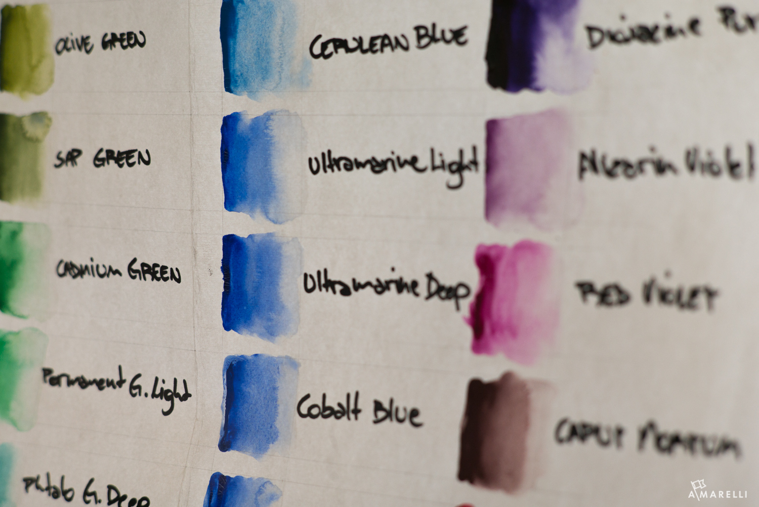
Camera sensors are made up cells that can detect red, green, and blue. All of the other colors of the rainbow are interpreted between those three colors. The camera does not actually “see” orange, rather it makes a guess based on surrounding information. The colors that get missed make up a large part of anyone’s photograph, unless of course you are photographing something like wooden children’s blocks. So what colors does a camera miss in their native form?
The colors a camera sensor can’t see, but can guess:
• Yellow
• Yellow-Orange
• Orange
• Red-Orange
• Red-Violet
• Violet
• Blue-Violet
• Blue-Green
• Yellow-Green
The list of colors the camera interprets is much longer than what it actually sees. The consequences of this can be significant. If you do not know how to adjust the colors in post production, than photography becomes more of a prayer and less of a practice. Keep in mind that adjusting color channels is different that adjusting global color temperature. What do I mean?
If you do not know how to adjust the colors in post production, than photography becomes more of a prayer and less of a practice.
Adjusting the color temperature of a photograph is how you remove color casts that affect the entire picture. For most photographers that means striking a balance between BLUE/YELLOW and GREEN/MAGENTA.
Once you arrive at a color balance where things look “fairly” neutral, then you can start dealing with saturation. I say “fairly” because if you go down the rabbit hole of believing there is a 100% perfect neutral, you will disappear into a theoretical oblivion that changes the split second your picture leaves your computer. The aim is to get it mostly right, then tweak the color adjustment for the final application (print or web). For anyone asking themselves if there is perfect color, the answer is no. The best color that can ever exist are the colors that are balanced in the picture and then placed in a room for viewing at certain times of the day and certain times a year.
TRAVEL TIP: If you want to see what an artist saw, visit a painting in a museum that has northern light at the time of year the painter made it. Van Gogh painted all year round, which means that paintings in the Van Gogh Museum only look “right” one quarter of the time. The summer paintings look right in the summer and the winter paintings look right in the winter. Visiting a painting at the right time of day and the right time of year can make a huge difference to how that painting feels.
There are endless tutorials on adjusting color temperature. They are ok if you are training to be a lab technician, but they tend to make a process that should take a minute or two into hours of theory that still yield very bland pictures in my eyes, which is why I do not recommend them.
The approach that I use for adjusting color is adopted from painting. Why? Because if I can mix the colors that appear in a photograph, by hand and from scratch, it means that I know what the color is, how it is made, and what changes need to occur if I want to make an adjustment. It is far and away the best way to understand color. But not everyone has time to learn how to mix paint. We can use the tools of the camera and post production to actually train your eyes to see better. These little tips will make it much easier for you to make your own adjustments without hours of post production tutorials.
We can use the tools of the camera and post production to actually train your eyes to see better.
What is the first thing you need to understand?
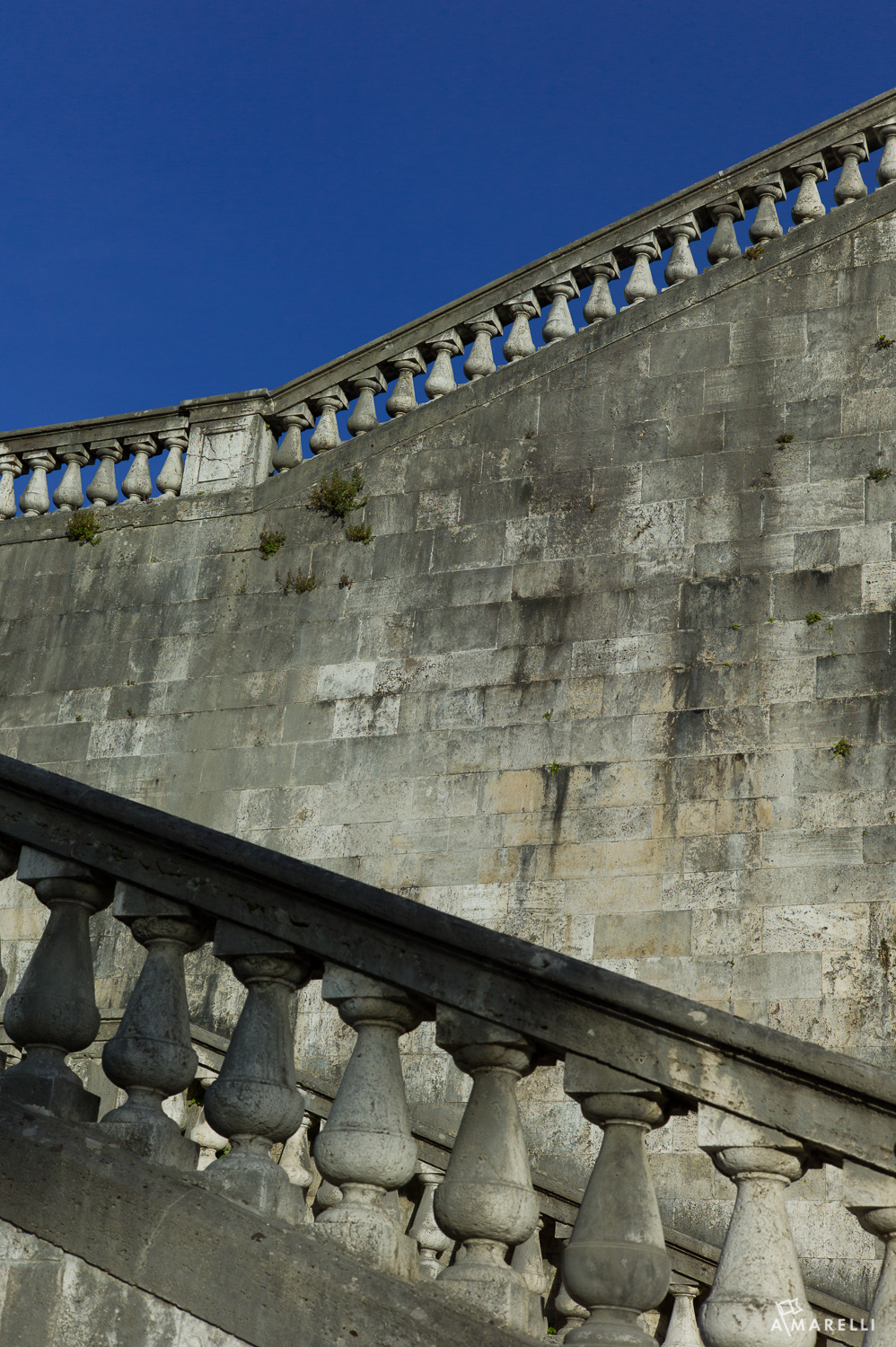
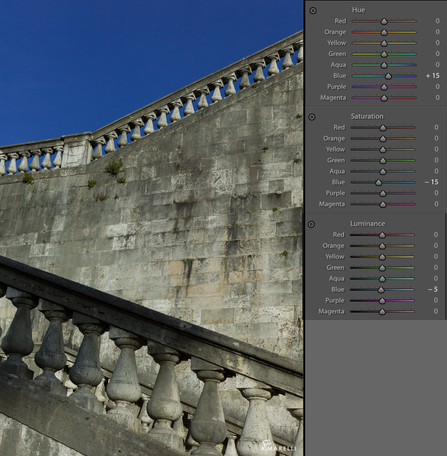
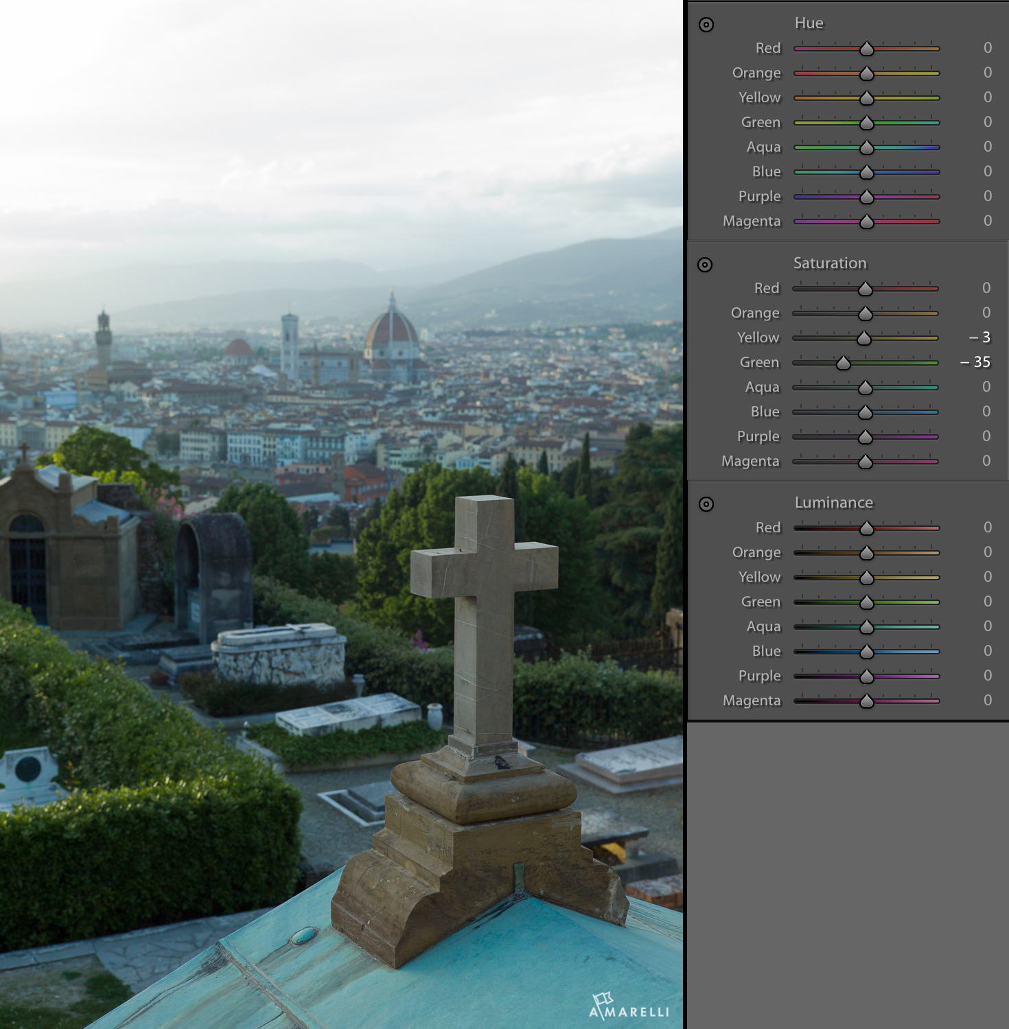
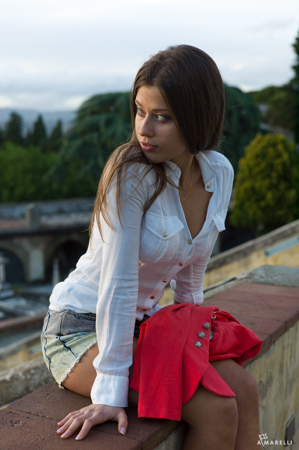
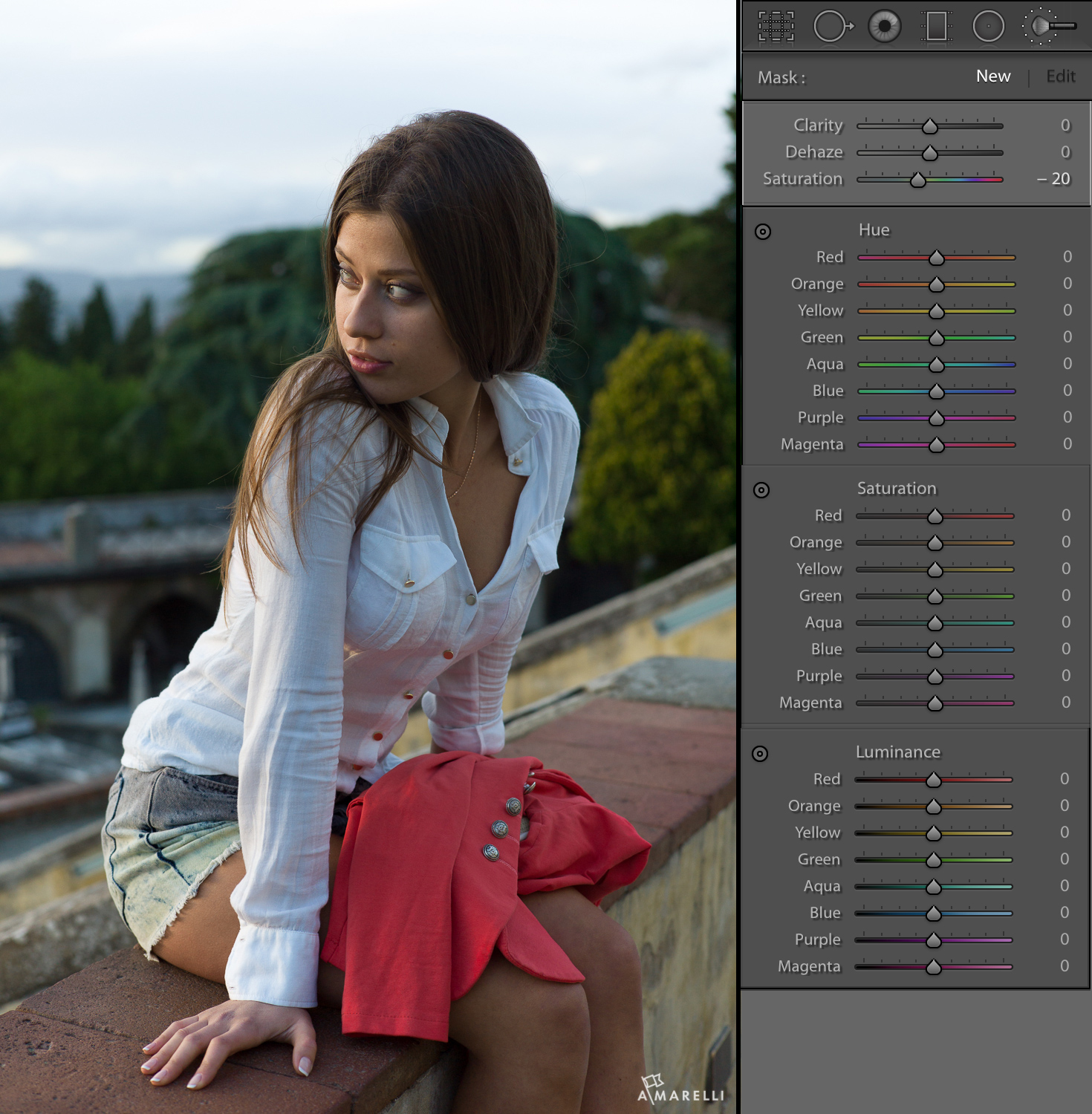
Any picture containing a red, green, or blue object will be over saturated. Essentially this means that the camera is ALWAYS kind of wrong and it is not your fault. It does not matter how the auto white balance is set up or what presets you use for import. A sensor that can only see in RED, GREEN, and BLUE is going to over estimate the thing it is designed to see. It will make the reds more red than an orange. It will make the blues more blue than a violet and the greens will be way more green than they actually are.
In the next few posts, I will break down examples in each of the colors the sensor sees to show you how to adjust for saturation, luminance, and hue. These will be subtle changes, but the total effect will allow you to see cleaner colors and create pictures with greater intention.
Up first … how to post process for a blue sky coming up on August 30.