In the last article we explored the colors that come directly out of a camera and how they are almost never right. The three main channels of red, green, and blue are over saturated. This will make anyone’s photograph look like a five-year-old colored it in, rather than an artist. But how can you easily adjust for the mistakes that a camera will make? You can make subtle shifts to hue, saturation, and luminance to restore the beautiful range of colors your eyes see, without making a picture that is overly processed.
There is a famous story about a retired nuclear engineer who was called back to the plant because there was a problem. The plant engineers did not know how to stop the imminent meltdown and begged the engineer to save them. He said that he would, but under one condition. He requested that they pay him $1,000,000.00. Since they had little choice, they agreed.
The engineer reached over and flipped one switch and the gauges went back to normal. There was no meltdown and the day was saved, but the plant engineers were upset.
“We paid you $1,000,000 to flip a single switch?!” they said.
“No,” said the retired engineer. “You paid me $1 to flip the switch. The other $999,999 was to know which switch to flip.”
Whether this nuclear meltdown scenario actually happened, I can’t say for sure. I’ve heard it a number of times in a handful of different formats. But what I enjoy about it is how it perfectly illustrates the photographer’s dilemma.
Post production on color photographs is a matter of knowing which switch to flip.
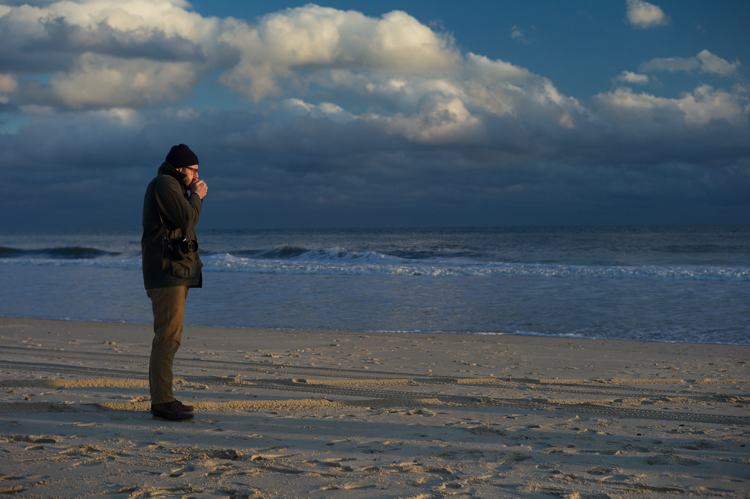
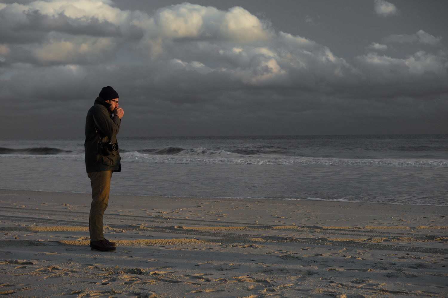
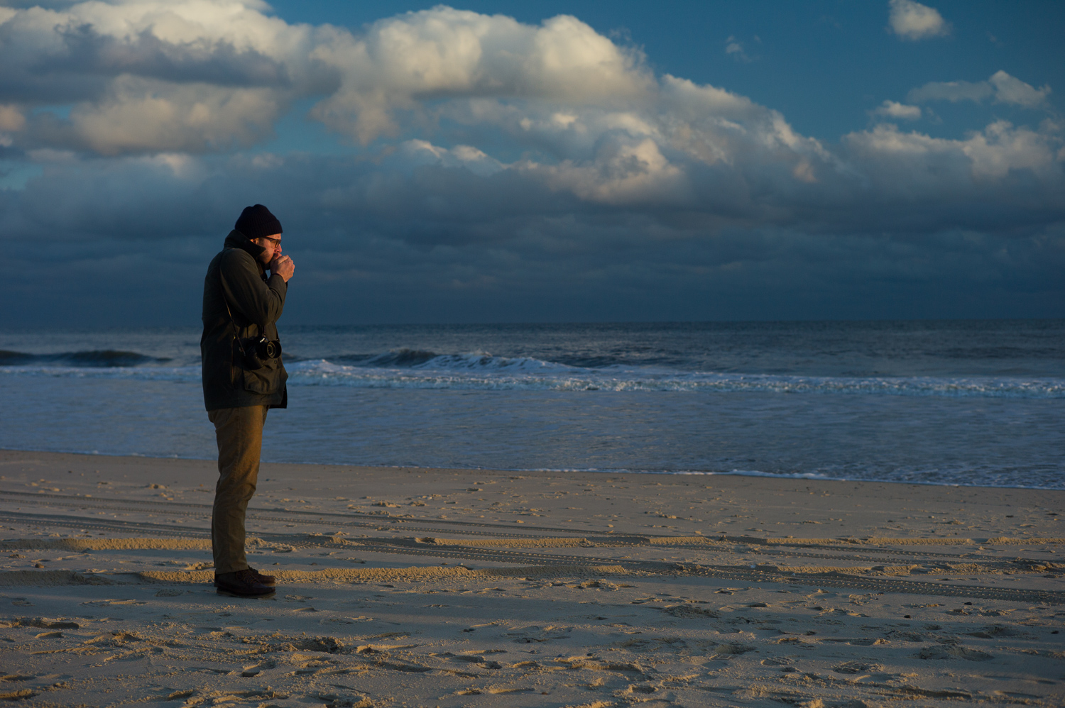
Adjusting color for the sky is a good place to start. The advantage is that a blue sky, with a few clouds or empty, is an easy entry point to making color adjustments like an artist. Unless you live in the UK (like I did in the ’90s and there were only five days of sun in six months) finding a blue sky should not be too tough. (London and I have since made peace, but I was told that it was one of the worst winters in 311 years.)
The only person who makes a sky pure blue is a child with a box of crayons. And I don’t imagine anyone wants their post production to look like it was done at the hand of a five-year-old. Blue skies have a subtle range of blue violet, blue gray, and blue green.
At the same time “white” clouds in the sky often have a hint of red violet to them. The aim of color adjustment is to give your picture unity. The colors should work together, otherwise the photograph will look like it is made of paper cut outs.
How does one of the greatest painters of all time deal with color?
Color is my daylong obsession, joy, and torment.
– Claude Monet
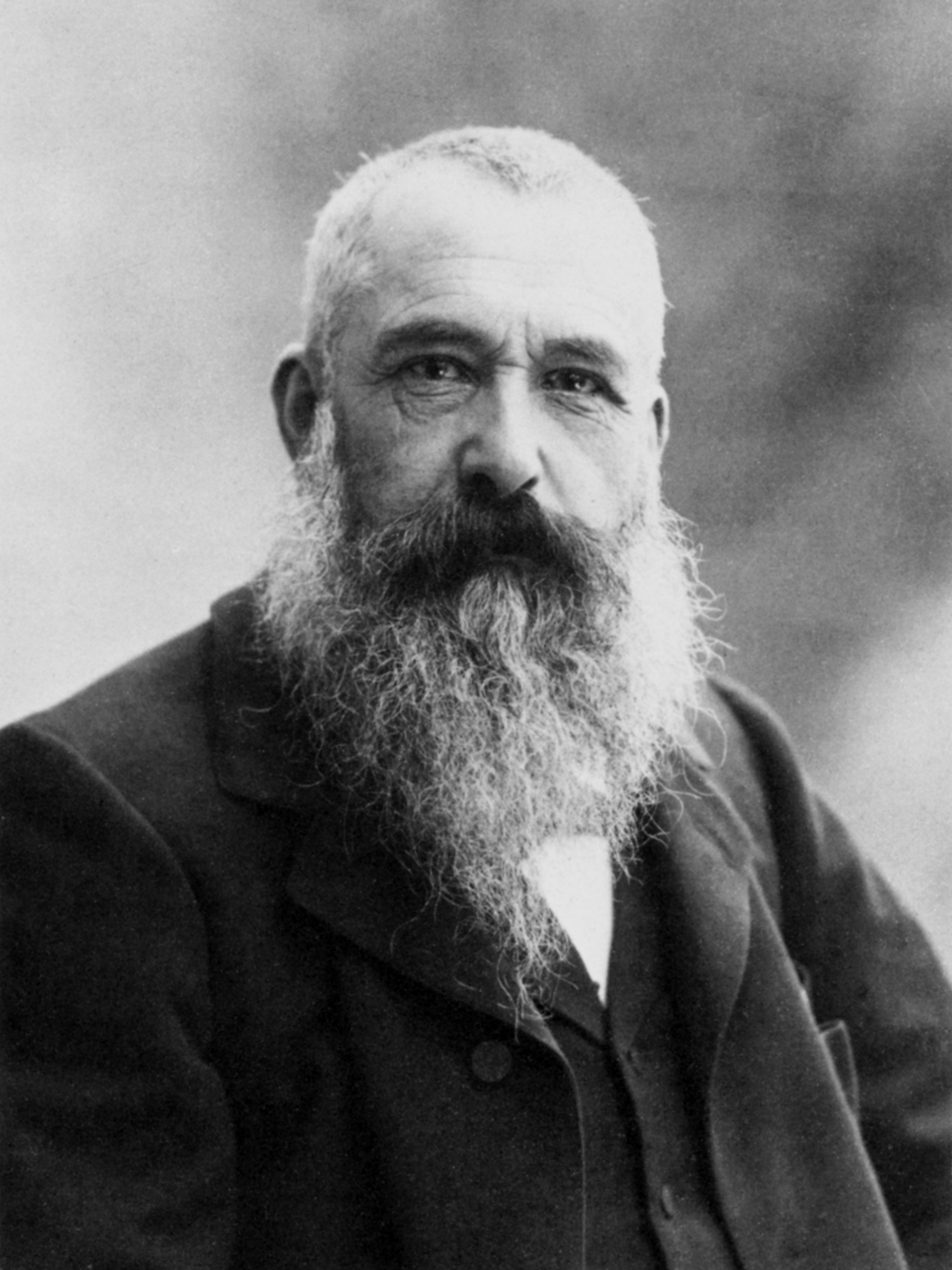
Claude Monet was responsible for helping the world see that things like the sky are not just blue; they have hints of other colors mixed in. His distinct Impressionist style, which is free from lines and hard form, experiments with the range of colors that we can find in architecture, landscapes, objects, and also a blue sky.
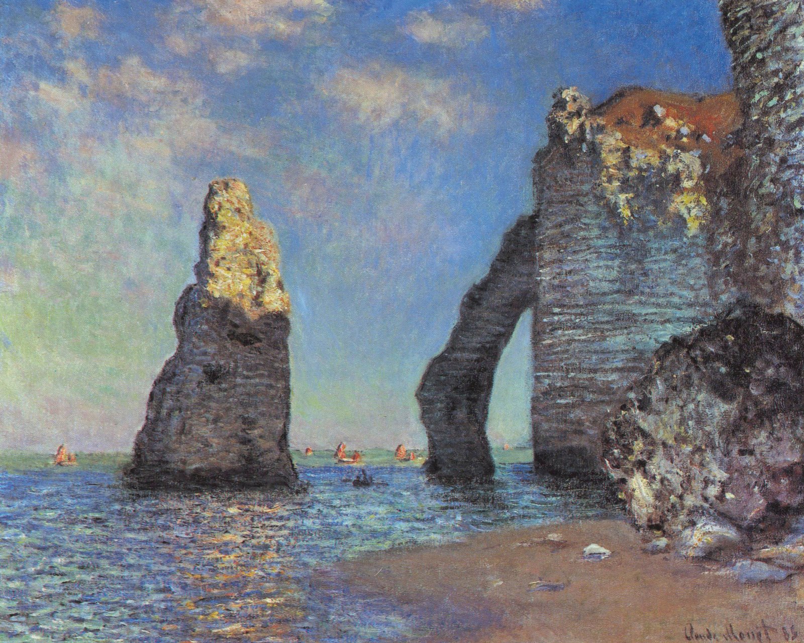
Let’s look at one of his paintings “The Cliffs at Etretat” and observe what colors he includes to achieve a natural looking sky.
• Top Right: In this section the sky is actually a medium dark blue gray.
• Top Left: The sky is medium light blue gray.
• At the horizon: The sky fades to medium light blue green.
• Clouds: The highlight side of the clouds is yellow gray and the shadow side is orange gray.
A note about Gray
Since a photographer cannot “add gray” back to a color, we de-saturate the color intensity to let the gray come through. Painters will talk about mixing neutrals, but in photography language it just means “de-saturate” slightly. Almost every color in his paintings is a three color mix, which means there is a little gray in everything. This is an excellent point to observe because if the goal is to create a picture that has unity and also looks naturalistic, there will be a fair amount of gray throughout a color picture.
How to adjust for a blue sky
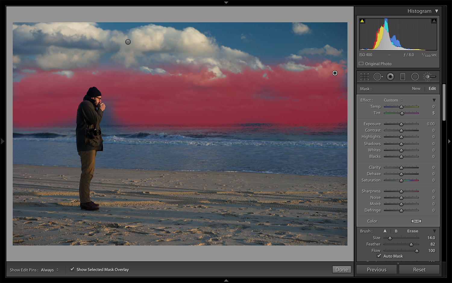
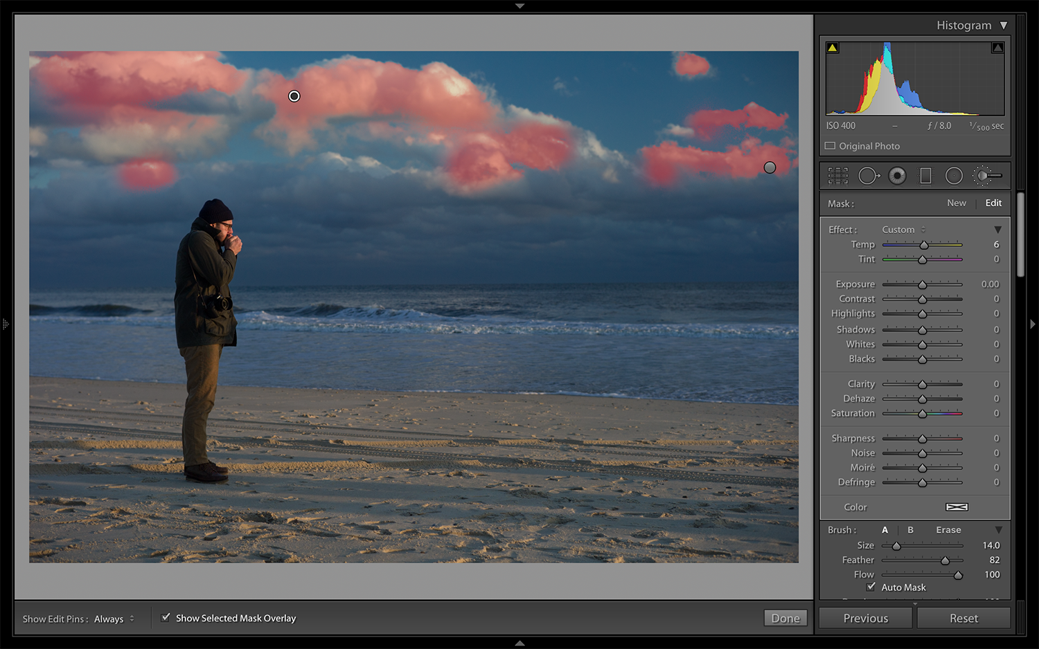
The overall effect will give you slightly more contrast to the sky, without overpowering color. It will allow for a shift from cool to warm in the clouds and it will let the thinner clouds sit in the background. When this happens the sky will feel like there is greater depth.
In the beginning it might seem like a lot of steps to go through, but after you edit a few dozen photographs, you will get a sense of what a sky actually looks like and be able to make the adjustments much faster.
When you are all finished, here is a little test you can give yourself. Sit outside and look at the sky in the late morning or early afternoon. Wait for the dramatic colors of sunrise to burn off or catch it before sunset happens. Notice how the hue, saturation, and luminance of the sky change at the horizon, with clouds, and directly above you.
As you become a keener observer of nature, like Monet was, you will know which switches to flip so that your pictures and their colors all work together.